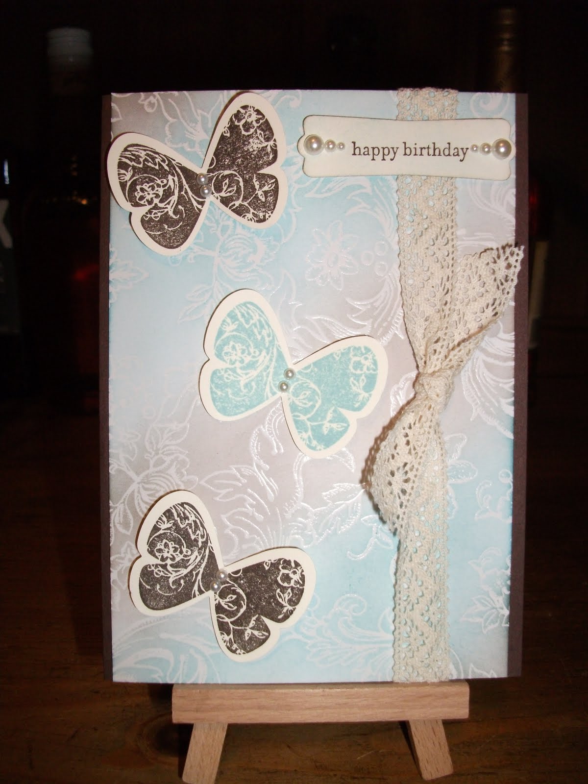
Showing posts with label pearls. Show all posts

Sunday, January 12, 2014

Water colouring technique

I'd seen a lot of this water colouring technique on craft (or crumb cake) coloured card so I thought I'd give it a go. After white heat embossing the flowers I used white ink to water colour the flowers. Then I used regular pink ink to water colour over the white. I think I did two or three layers of the pink to achieve some shading on the flowers. The colours are more intense close up.

Materials:
Cardstock: Crumb Cake, Rose Red
Ink: Rose Red, Versamagic in Cloud White, Versamark (I can't remember if the background was stamped with Versamark or Rose Red ink)
Stamps: 5th Avenue Floral, Distressed Dots
Accessories: Basic pearls, chipboard 'happy birthday', waterproof craft mat
Tools: Big shot machine, top note die, heat tool, white embossing powder, embossing buddy, aqua painter pen, Sakura clear glitter gel pen, liquid glue

Tips:
1. I sponged the chipboard with white ink and let it dry before using the glitter gel pen over the top.
2. The stamens of the flowers were also coloured with glitter gel pen but I must have done that after I took the photo.

Sunday, March 4, 2012

Playing with a new stamp set

I broke out another unused stamp set today - Simply Soft. It features pretty detailed flowers and has 2 step stamps (I didn't 2 step them today though). This design belongs to Lana Harvey from Lana's Stampin' Cottage. I loved her card so much I didn't change anything except to suit my own supplies.

I made two colour variations:

We'll call this card 1.

And this is card 2.

Materials:
Cardstock: Card 1 - Very Vanilla, Lovely Lilac (retired Stampin' Up colour). Card 2 - Whisper White, Island Indigo.
Ink: Lovely Lilac, Island Indigo, Stazon black, Old Olive marker.
Stamps: Simply Soft.
Accessories: Victoria crochet trim, Basic Pearls, Blue organza ribbon (Kaiser Craft).
Tools: Big shot machine, Vintage Wallpaper embossing folder, Top Note die, sponge, aquapainter, Beautiful Wings embosslit, mini glue dots.

Tips and Tricks:
1. I cut the top notes before stamping the images on.
2. I used an aquapainter to colour the flower heads and buds. I used an Old Olive marker for the stems and leaves.
3. The stamped top notes and Vintage Wallpaper layers are sponged with the feature colour (Lovely Lilac or Island Indigo).
4. I'm not good at tying bows so the ribbon is adhered in two parts. A length is cut and stretched across the front of the card. The ends are taped behind the card layer. Another length is used to tie a bow around the first part. Hey, it works for me!
5. Card 1 would look so much better with matching ribbon but I didn't have any.

Stuff Ups:
1. I would have used the 2 step stamps but forgot to use my stamp-a-ma-jig on the outline stamp. It was fun to aquapaint any way.
2. I would use Certainly Celery or another light green marker rather than Old Olive. I feel it is too dark for the look that I want.
3. The sponging is uneven but I can live with it.

Pleasant Surprises:
1. The overall look of the aquapainting is ok.
2. The way the organza ribbon matches the Island Indigo was a lucky surprise! It looks lighter than the cardstock in the photo but that's due to the nature of the ribbon versus the camera. In real life it matches perfectly.

Wednesday, January 18, 2012

New Stampin' Up colours

When I saw this card design I loved it for two reasons - 1. The colours it uses are the new In Colors for Stampin' Up, some of which I haven't used yet. 2. It features a stamp set that I have and hadn't used yet either.

So this card design is not mine, I found it while searching for some inspiration. It's made by Nancy Riley, click on her name to check out the card that she made. Here's my version of her card:


This is for my sister-in-law.

Materials:
Cardstock: Wisteria Wonder, Pool Party, Lucky Limeade, Whisper White.
Ink: Wisteria Wonder, Calypso Coral.
Stamps: Array of Sunshine (Stampin' Up) and Sophie's Sentiments (Lawn Fawn).
Accessories: (This used to be called 'other')  Basic pearls, ribbon (American Craft),
Tools: (This is a new section) Beautiful Wings embosslits, Circle punch, bird punch, scallop edge punch (Fiskars), Lattice embossing folder, 2 way glue pen, dimensionals, mini glue dots, scissors, double sided tape, big shot machine, Scoring board (Martha Stewart).

Tips and Tricks:
1. The branches and leaves were punched with the bird punch. I ran them through the big shot machine in the lattice embossing folder. I used a 2 way glue pen to adhere them to the card.
2. The coral flower was stamped 3 times and cut out. On two of the flowers, I've just cut out the inner sections and layered them with dimensionals.
3. The circles are glued on with a 2 way glue pen as I don't want the edges to lift up. A tape runner wouldn't get close enough the the circle's edge.
4. The butterflies are stuck on with mini glue dots.

Stuff Ups:
1. Originally I used a Vintage Wallpaper embossed piece of Wisteria Wonder instead of the circles but it was too busy for the look that I wanted.
2. When I finished the card, I had a sip from my can of Coke Zero and a drop of condensation landed on my card - oh no!! I got out my heat tool to dry it and it only let the faintest of watermarks. Silly me.
3. Looking at the card now, maybe I should have stuck the lowest branch over the ribbon instead of under it?

Pleasant Surprises:
1. I'm pleased with the overall look of the circles. I like that textured effect.
2. The ribbon matches the Pool Party butterflies nicely.
3. For once my cutting out was not too shabby!

Monday, November 7, 2011

The last of the brown (for now)

So I made this card for my friend Tracey whose birthday is today (Happy birthday Trace!) and my husband said it's nice but I've been using too much brown lately (yeah, brown has been my neutral colour of choice, mainly because I bought a whole pack of it). I thought this sounded like a challenge (in a warped kinda way) so I'm making cards without brown for a little while! This is the last of the brown for now:

The design of this card is from an old Stampin' Up catalogue. I've tweaked it to suit my whims.

Materials:
Cardstock: Chocolate Chip, Crumb Cake, Whisper White, Elegant Soiree DSP.
Ink: Versamark, Memento Tuxedo Black, Crumb Cake.
Stamps: Blissful Botanicals and Sophie's Sentiments by Lawn Fawn.
Other: Fiskars Eyelet border punch, Victoria crochet trim (I've called it lace in the past but it's not really called that), Perfect Pearls Mist in Heirloom Gold, American Craft ribbon, circle punch, Basic pearls, Big Shot machine, Beautiful Wings embosslit, mini glue dots, sponge, Fiskars corner rounder punch.

Tips and Tricks:
1. I lightly misted the Whisper White panel with the Perfect Pearls and let in dry before stamping on the sentiment.
2. I sponged around the butterflies with Crumb Cake ink.

Stuff Ups:
1. I messed up the alignment of the border punch so I had to do that again.

Pleasant Surprises:
1. I got the sentiment stamped correctly, first time! Gosh, I love Lawn Fawn stamps!!

Friday, September 30, 2011

Get Well Soon

This card was inspired by a card from an old Stampin' Up catalogue. I changed the colour scheme, stamps and ribbon, did some heat embossing and ended up with a result with which I am pleased.
I also broke out my new Lawn Fawn stamps and I am in love with them! They have a very different stickiness to them that I've never come across before with clear stamps - fun to poke and play with! The ink doesn't pool like on normal clear plastic stamps - it goes on smooth and crisp! Very pleased! You will be seeing more Lawn Fawn stamps here soon.

I made two of these: one as a thank you for my line manager and this for my Mother-in-law.


I watched a few ribbon tying videos on Youtube and I think I am on my way to ribbony happiness.

Materials:
Cardstock: Chocolate Chip, Blushing Bride textured and plain, Kiwi Kiss textured and plain, Very Vanilla, Crumb Cake.
Stamps: Cottage Garden.
Ink: Chocolate Chip, Blushing Bride, Kiwi Kiss, Versamark.
Other: Basic pearls, Mat pack, Paper piercer, mini glue dots, dimensionals, stamp-a-ma-jig.
Non Stampin' Up: Sophie's Sentiments stamp set by Lawn Fawn, organza ribbon, Fiskars corner rounder punch, clear embossing powder, heat tool.

Tips and Tricks:
1. I wasn't planning on using the stamp-a-ma-jig but I accidentally stamped the 2 step flower perfectly (lol) and liked it so much I dragged out the stamp-a-ma-jig and did the rest of the flowers properly. The first step I stamped in the coloured ink and the second step (the outlined flower stamp) I stamped in Versamark, coated with clear embossing powder and heat embossed.
2. A mini glue dot secures the ribbon under the bow.
3. Basic pearls finish off the flower centres including the tiniest pearls for the flowers near the sentiment.
4. The mat pack hole guide was used for the paper piercing.

Stuff Ups:
1. I admit I took ages trying to line up the 2 step flower stamps before giving up and using the stamp-a-ma-jig. I got the green and brown ones fine but the pink just wouldn't match up.
2. The ribbon looks a bit kinked so maybe I should have ironed it.
3. I should have used some tombow or a glue pen rather than my tape runner for the green strip because the strip was too narrow. A teeny bit of glue can be seen from the front. Probably is not noticeable but enough to annoy me.

Saturday, September 10, 2011

Clean and Simple Birthday

I wanted to make a clean and simple birthday card for my friend Nean so I set myself a 20 minute challenge! This is the result:

The green does look much better in real life (like most cards do) and is textured which hasn't been picked up too well by the camera. That's probably my fault, not the camera's.

Materials:
Cardstock: Crumb Cake, Kiwi Kiss textured, Island Oasis DSP, Tempting Turquoise, Very Vanilla.
Ink: Tempting Turquoise.
Stamps: Teeny Tiny Sentiments.
Other: Big Shot machine, Top Note die, Victorian lace, Beautiful Wings embosslit, Basic Pearls, Modern label punch, dimensionals, mini glue dots.
Non Stampin' Up: None.

Tips and Tricks:
1. There are none really, this card is as easy as they get. I suppose I'll tell you that I cut up the Basic Pearl Strips into segments of two or three pearls and used them as the butterflies bodies.
2. The butterflies are stuck on with mini glue dots.

Stuff Ups:
1. This card could certainly be jazzed up with a bit of time and effort but I'm pleased with it as is.
2. Probably should have used Old Olive instead of Kiwi Kiss but I really wanted to use textured cardstock and I don't have textured Old Olive.

Saturday, July 16, 2011

Double But Different Part 2

So the first twin card is in my previous post. This card I made for Emma. I hope both of them like their cards!


Here's the card recipe (I know I should say procedure but recipe sounds so much cuter):

Materials:
Cardstock: Crumb Cake, Rich Razzleberry, Very Vanilla, Chocolate Chip.
Ink: Rich Razzleberry, Chocolate Chip, Versamark.
Stamps: Bliss, Itty Bitty.
Other: Top note die, big shot machine, Vintage Wallpaper embossing folder, Hemp twine, Itty Bitty buttons, Victoria lace, modern label punch, basic pearls, mini glue dots.
Non Stampin' Up: sentiment stamp from CheeseCake Party by Penny Black, Zing gold glitter embossing powder by American Crafts.

Tips and Tricks:
1. There are small pearls on the vintage wallpaper embossing but the photo doesn't highlight them.
2. The butterflies were stamped by using the 'Rock and roll' technique. I'd recommend that you search youtube for a video demonstrating the technique. I inked up the stamp in Rich Razzleberry then rolled the edges around on a Chocolate Chip ink pad. Voila! Two toned stamping.
3. The Victoria lace is just some scrap ends I had left over that are tucked and glued under the top note die cut with mini glue dots.
4. I used a mini glue dot to anchor the middle itty bitty button to keep them faced up.

Stuff Ups:
1. The clear mount block I used for the 'rock and roll' technique was too big which inhibited my control over the amount of 'roll' I could do. I would use the smallest block I possibly could if I were to do this technique again.
2. I probably should have glued all three itty bitty buttons or none at all because it looks a little lopsided with just one glued.
3. The gold glitter embossing powder - while I like the gold colour it produced, the glitter in the powder caused the end result to be a bit lumpy. I would have liked a smoother end result. Ideally, a gold powder without glitter in it would be a better choice.

Monday, July 11, 2011

Double But Different Part 1

I've just made two birthday cards for my husband's twin nieces birthday (they're grown up not kids) and since the two of them are so different, I've made very different cards. This is the card I made first for Jess.


Materials:
Cardstock: Early Espresso, Very Vanilla, Specialty DSP (retired I guess, it was in the summer mini catalogue).
Ink: Early Espresso, Baja Breeze.
Stamps: Butterfly Prints, Teeny Tiny Sentiments.
Other: Sponge, Modern label punch, Basic Pearls, Victoria lace (also from the summer mini), dimensionals, mini glue dots, Butterfly punch.
Non Stampin' Up: Nothing, woohoo!

Tips and Tricks:
1. I used caution when sponging the specialty DSP which means use ink sparingly. I lightly inked my piece of sponge then dabbed it onto scrap paper a few times before using it. I started at the edges and in circular motions I applied and buffed the ink onto the paper. It took a while to do. When finished, I used a clean sponge to buff over the whole image which removed any excess ink from the embossing and made it pop!
2. I adhered the butterflies with mini glue dots.
3. The sentiment label is sponged in Early expresso around the edges and lightly sponged on the face with Baja Breeze. I did this to dull the brightness of the bare Very Vanilla cardstock. It's popped up on dimensionals so it doesn't interfere with the lace.
4. I used all 3 sizes of basic pearls on the sentiment punch, starting on the outside with the largest. I cut a pearl strip into smaller segments of 2 for the butterflies bodies.

Stuff Ups:
1. I wasn't carefully enough in measuring my DSP so I had to trim it after the sponging and lost some of the great edge effect I got from the sponging process. I responged the cut edge but it's not quite the same.
2. The 'happy birthday' sentiment is a little off centre but I can live with it.

Friday, April 29, 2011

Mother's Day

I simply adore this Mother's Day card, however, I cannot lay claim to the gorgeous design. This design is by the incredibly talented Angie Brown from Stampin' Dreams. I loved it from the second I saw it and knew it would be perfect for my Mum for Mother's Day. It also has a lot of elements to it and not a lot of stamping.


The main differences between my card and Angie's are that I didn't have the same sentiment stamp as Angie so I lowered the placement of the bird and branches, and popped my sentiment up on the modern label punch out (my fave!). Also my white embossing powder was clumpy so I chucked it out (it was useless) and as a result I don't have that pretty detail on the bird's wing. I used plain old Versamark instead.

Here's the procedure:

Materials:
Cardstock: Shimmery White, Bashful Blue, Night of Navy. You could use Whisper White but the Shimmery White is much thicker cardstock and I feel it makes for a sturdier base card.
Inks: Bashful Blue ink spot, Night of Navy ink spot, Versamark.
Stamps: Vintage Vogue, Teeny Tiny Sentiments.
Other: Big shot machine, Top note die, Whisper White satin ribbon, Modern Label Punch, Bird punch, sponge, stick on pearls, retired triple flower punch, dimensionals, 2 way glue pen.
Non Stampin' Up: Polka dots embossing folder by Cuttlebug, black permanent marker.

Tips and tricks:
1. I sponged around the edges of the top note die cut, bird body and modern label punch out piece using Bashful Blue ink.
2. I punched 7 branches out of Night of Navy cardstock using the bird punch. I trimmed them to fit the way I wanted and glued them down with the 2 way glue pen.
3. I coloured a basic pearl with black permanent marker to create the bird's eye.
4. I've mentioned it before, the satin ribbon frays as soon as you look at it so handle it as little as possible.
5. I used Night of Navy ink to stamp the sentiment. I didn't think Bashful Blue was powerful enough.

Stuff Ups:
1. As I said, I was planning to emboss the stamping on the bird's wing in white and then sponge over it with Bashful Blue but my embossing powder was clumpy and no good. It wouldn't stick properly to the Versamark.
2. The Polka dot embossing folder was a little too small for the layer size that I wanted so one end is a little bit sparse with dots.
3. My SNAIL adhesive is really hard to use. It just doesn't want to turn and it is starting to dent my cardstock. It's very disappointing. I also left my back up double sided tape at work so I had to use my precious mini glue dots on the back of the polka dot embossed layer. Using tape rollers can flatten your embossing so it's always best to use peel-the-backing-off it tape (known as Sticky Strip in the Stampin' Up world).
4. My layers are always skewiff, never proportional.

Thursday, April 21, 2011

Island Oasis Birthday

I made two of these cards for two friends who's birthdays are in April. Actually they are on the same day! The colour scheme and basic layout of the card was cased from Shaz's Card Table. I added my own style and elements to the card to make it kate-ified.


Below is the insert I will write on then stick into the card. That way if I mess up what I'm writing I haven't ruined the card. It also looks nicer and if your card base is dark, a lighter coloured insert will make reading your written message easier.


I used the flower stamp from the Tropical Party stamp set and added a tiny pearl to the centre of each flower. You could layer the insert on another colour, such as Rose Red, but I want to conserve my cardstock.

Materials:
Cardstock: Tempting Turquoise, So Saffron, Rose Red, Whisper White, Island Oasis DSP.
Inks: Pumpkin Pie ink spot.
Stamps: Tropical Party.
Other: Modern label punch, 6mm Pumpkin Pie Grosgrain ribbon, dimensionals, Lattice embossing folder, big shot machine.
Non Stampin Up!: White stick on pearls from Kaiser, Versamark Dazzle - Frost, 'happy birthday' sentiment from Penny Black's Critter Party stamp set, Prima Flowers High Gloss Pebbles - Birds and Butterflies.

Tips and Tricks
1. The lattice embossing folder doesn't fully fit the length of card required for this project. I managed to press the card once, then align the impressions at the end of the card with the unpressed card inside the folder. Then I put it a little way into the big shot machine. That way it doesn't flatten the already embossed card. That all sounds wordy but I don't know how else to explain it.
2. Never press hard when cutting an embossed piece of card in a paper trimmer. You can crush and damage the embossing. Just use very gentle pressure, enough to stop it slipping.

Stuff Ups:
1. I forgot to allow extra card (only a few millimetres) for the embossing to 'shrink'. I had to trim down my base card to make it all the same length.
2. I wasn't too careful when peeling the pebbles of the backing sheet and the image ripped away from one of the pebbles. Always be gentle! They are a bit pricey for what they are so you don't want to waste them.
3. I would have heat embossed the palm fronds on the background if I hadn't lost my clear embossing powder. So frustrating!!

Saturday, April 16, 2011

Our Anniversary

This is hot off the press! It's the anniversary card I have made for my husband. Tomorrow is our second anniversary! Yay us! I'm super proud of this card. No casing, an all Kate design! I used a lot of different stamp sets too.

As usual, the photo doesn't do justice to the card. I used the Colour Coach to get my colour selection - Pear Pizazz, Cajun Craze and More Mustard. I added Very Vanilla because it needed something else.

My gorgeous husband loved the card. The first thing he said was, "Ooh, I like the colours!" Well done Colour Coach! Jason gave me a stunning jewellery box for our anniversary! I have been wanting one for so long, it's just perfect!

Materials:
Cardstock: Pear Pizazz (in colour), Cajun Craze, More Mustard, Very Vanilla.
Inks: Pear Pizazz, Cajun Craze, More Mustard, Versamark.
Stamps: Itty Bitty Bits (hearts on the tags), So Happy For You (background heart on pear pizazz), Teeny Tiny Sentiments, A Happy Heart (retired - big hearts).
Other: Big shot machine, Top Note die, Lattice embossing folder, Hemp twine, Itty Bitty buttons, mini glue dots, stick on pearls, modern label punch, dimensionals, paper piercing tool and mat pack, sponge.
Non Stampin Up!: Fiskars tag punch.

Tips and Tricks:
1. As in my last card post, I ran the Cajun Craze and More Mustard cardstock through the big shot machine together with the top note die. I trimmed the more mustard along the perforation to get that nice border of Cajun Craze. Next I used snail adhesive to stick them together before putting it through the big shot again in the lattice embossing folder.
2. You can't really tell but I put a round Itty Bitty button on each Cajun Craze heart on the tags and a tiny pearl in the centre of each More Mustard heart on the tags to tie in with the pearls on the sentiment. I want to buy the tiny tag punch from Stampin Up! because I find this Fiskars tag punch to be too big. Also the tiny tag punch punches a hole in the top of the tag and the Fiskars doesn't. I had to use my paper piercer which looked messy. I should have used my eyelet tools but forgot I had them till after I finished.
3. The 'Happy Anniversary' sentiment is stamped in Pear Pizazz ink but you can't tell in the photo. I also sponged around the label in Pear Pizazz ink.
4. The Top note die cut is popped up on dimensionals to compensate for the bulkiness of the twine. The sentiment is also on dimensionals.

Stuff Ups:
1. I pulled the twine too tightly when tying it and it cut into the cardstock a little.
2. On the insert that I wrote on inside the card, I accidentally wrote on it portrait-ways (standing vertically) when the card is made in landscape (stands horizontally). I hope I explained that correctly! I didn't want to rewrite it because it came from the heart and I didn't think hubby would care much less notice!
3. Overall the tags are very clumsy. I also forgot to sponge around them with pear Pizazz ink. I would have liked the tags smaller and more precise in their creation but you gotta work with what you've got.

Monday, March 21, 2011

A new colour scheme

I've made two similar cards this week using a colour scheme I would not normally choose. I had some gorgeous Sunny Garden DSP that was screaming to be used. Also my Stampin' Up order came in so I had new toys to play with. These cards, while probably similar to other cards out there, were again from my own mind. I'm glad these worked out because one I attempted earlier in the week just doesn't do it for me.


The 'Thank You' card I made for my Mum and Dad. The 'Congratulations' card I made for my nephew's housewarming.

Materials:
Cardstock: Daffodil Delight, Poppy Parade, Peach Parfait, Pear Pizzazz, Sunny Garden DSP.
Inks: Poppy Parade inkpad.
Stamps: Curly Cute, Punch Potpourri.
Other: Bird punch, Top Note die, Big Shot machine, Daffodil Delight grosgrain ribbon, Modern word label punch, stick on pearls, 2 way glue pen, mini glue dots.
Non Stampin' Up: Polka dot embossing folder by Cuttlebug, Prima Flowers.

Tips and Tricks:
1. I cut out the Poppy Parade and Peach Parfait top notes at the same time, then trimmed the Peach one along the perforation line. I glued them together with SNAIL (glue tape) and then put it in the polka dot embossing folder and ran it through the big shot.
2. I used a 2 way glue pen to glue the leafy branch to the card.
3. On the 'congratulations' card, I cut an extra piece of ribbon and threaded it around the base ribbon. I find that easier than trying to tie it all at once.

Stuff Ups:
The only one (omg, only one!) is that the 'congratulations' sentiment is glued on crooked. I was so annoyed that I didn't spot it until after the glue had set.

Wednesday, January 19, 2011

Cupcake Birthday

Had a busy day cardwise! I went to my Mum and Dad's place to show Mum some of my card making gear and to make a few cards. I had fun and I hope Mum did too - hi Mum!!

I made another tropical birthday card for my sister-in-law. Her birthday is on Friday. I also made a Valentine's day card for my husband. I'll post that one tomorrow as the Glossy Accents I put on it is still drying.

Here's a card I made a few months ago for the 'Stamping For Lara' forums challenge. The challenge was simply 'Cupcakes'. I only own one stamp with a cupcake on it from a gorgeous Penny Black set. I made my first attempt at watercolouring with that card. I wish I'd kept it but I gave it to a friend for her birthday. Oh well, hope she liked it. Here it is:

Rating: Decent


I really enjoyed the watercolouring and think I did well for a first attempt. The colour graduation (is that the right word?) on the cupcake case is my favourite bit. So is the glittery icing but the photo doesn't pick it up.
I chose the pink, brown and white colours because they most remind me of cake. Yummy, oozy chocolate cake with delicious strawberry or vanilla icing. Yummo!

Materials:
Cardstock: Chocolate Chip, Whisper White and Pink Passion (a retired colour).
Inks: Chocolate Chip, Pink Passion, Perfectly Plum, Daffodil Delight, Certainly Celery, Marina Mist, Cajun Craze.
Other: Whisper White satin ribbon, stick on pearls, corner punch, oval punch, aqua painter, sponge, 2way glue pen.
Non Stampin' Up: Watercolour paper, black Stazon ink, Cuttlebug embossing folder: D'Vine Swirls, Penny Black 'Cheesecake Party' stamp set, Wendy Irving Collections: Expressions Clear Cling Stamps -  'Occasions', white superfine glitter.

Tips and Tricks:
1. Watercolouring can be a time consuming process so a lot of patience is required, especially if you are new to it.
2. Don't squeeze your aqua painter and use too much water because all it will do is run and blend with other colours.
3. Start with your lightest colour first and build up to the darkest colour. There are plenty of tutorials if you search google or youtube.

Stuff Ups:
The corner punch - sometimes it bites in too far and I get a funny little recess (rebate?) that does not look good. I tried to even it out with scissors but the effect is not too good. Anyone know how to prevent my corner punch from biting in too far?

The ribbon - I didn't have scissors that would cut ribbon properly so it doesn't look straight. Get a pair of scissors or snips that are dedicated for cutting your ribbon and nothing else. Also satin ribbon frays as soon as you look at it so handle it as little as possible.

The layers - too wide. It's amazing how layers can take up so much of your card. I would make these thinner next time so I could put the sentiment elsewhere. It looks stuck on and out of place.

Tuesday, December 28, 2010

Hmmm... a birthday card?

This card was made for a design challenge when the Stamping For Lara forums were active. I suppose the most obvious use for this card would be a little girl's birthday, after adding a sentiment of some kind, but I know I won't be giving it away. This one is a keeper!

Rating: Decent

Materials
Cardstock: Kiwi Kiss, Tempting Turquoise and Pink Flamingo DSP (retired).
Inks: So Saffron, More Mustard, Pink Pirouette, Tempting Turquoise, Kiwi Kiss, Regal Rose.
Other: Very Vanilla satin ribbon, Stick on pearls, big shot machine, dimensionals, aqua painter.
Non Stampin' Up: Watercolour paper from Jackson's Art Supplies, gold star brad also from Jackson's, Cuttlebug embossing folder: - Tiny Bubbles, Doodlebug Designs: Sugar Coating - Swimming Pool glitter, C.C. Designs: Sugar Plums - Mermaid Emma stamp, black Stazon Ink, mini easel also from Jackson's.

Tips and Tricks:
1. I stamped Mermaid Emma on watercolour paper with stazon and then used ink pads and an aqua painter to colour her.
2. I cut a slit in the fold of the card to thread the ribbon through.
3. The yellow flower paper layer is DSP from the Pink Flamingo series which is now retired. The red flowers on a card in a post from last year are from the same paper series.
4. There are pearls on her tiara and her waist. They match the very vanilla ribbon but the photo doesn't show that.

Stuff Ups:
I wasn't (and still aren't) good at aqua painting so some of the colours have run. I was impatient and didn't wait for some sections to dry properly. As a result some colour bleeding and mixing has occurred. I have since learned that stamping in Versamark and heat embossing in black can help prevent this from happening. It also looks cool.

Monday, December 13, 2010

Wedded Bliss

Let's start with my favourite card. I made this last week for my good friend's Catherine and Anthony, to celebrate their wedding. I matched the colours to the colours Catherine had chosen for the wedding - the pink for the bridesmaids' dresses, grey for the groomsmens' suits and white for Catherine's dress. As luck would have it, she also had pearls on her dress, veil and accessories. Truthfully, I didn't think my skills were up to the task of making a wedding card. I am surprised and pleased with the results. I wouldn't have given them the card if I felt it was dodgy. This card makes it to the decent end of the scale.

Ooh, a scale! I should rate my own cards! Ok then, here's the scale: Disastrous, Dodgy, Decent, Delightful.

So if that's the scale, I'm gonna bump this card up to delightful. I don't think I'll create much better than this.

All photography featured in this blog is done by me and has a firm 'dodgy' rating.

Rating: Delightful.

To create this card I used products from Stampin' Up. I don't sell Stampin' Up but the colour coordination is something that can't be beat.

Materials:

Card stock: Shimmery White, Blushing Bride, Basic Gray.
Inks: Blushing Bride, Versamark, Versamark Silver Frost (I'll need to confirm that name).
Stamps: Punch Potpourri (hostess level 1) for the heart and Curly Cute for the word 'congratulations'.
Other: Vintage Wallpaper embossing folder, big shot machine, silver embossing powder, Pearl accents, 2 step Bird punch, Whisper White satin ribbon, corner punch, dimensionals (foam adhesives).
The mini easel is from Jacksons Art Supplies.

Tips and Hints:

1. Stamp Basic Gray and Blushing bride card stock with the Versamark silver frost stamp pad. Cover enough to punch out a bird and a wing using the 2 step bird punch. The versamark gives a nice shimmer to the card stock. This will need a while to dry or the wing won't adhere to the bird.
2. Wrap a piece of satin ribbon around the 2 layers of card, just enough to reach around the back and stick it down on the back. Cut a smaller piece to tie on the front. Touch the ribbon as little as possible because it frays as soon as you look at it.
3. You might not see them but I used the smallest stick on pearls on the vintage wallpaper background to give the card a lift.

Stuff Ups:
Corner punch - sometimes it nips in too deep so you get a jaggedy bit on either side of the punch instead of a smooth rounded corner. I tried to round it off with scissors which worked this time but not always.
Versamark silver frost - I didn't wait long enough for it to dry so some sparkle came off of the wings.
Pearl placement - I put on too many and taking some off was difficult. They stick down too well!