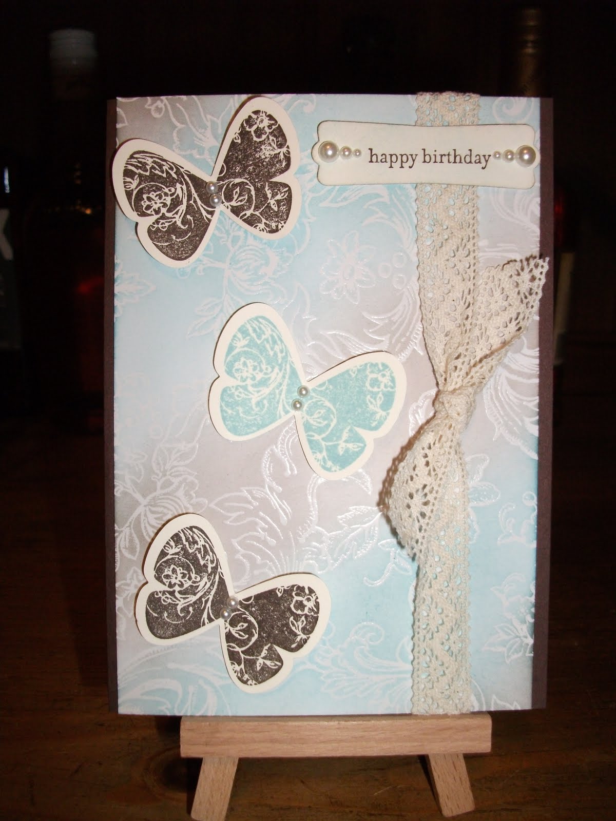
Showing posts with label Very Vanilla. Show all posts

Monday, January 13, 2014

Anniversary

I didn't realize just how many cards I hadn't posted last year. Here's last year's anniversary effort for my husband. For some reason I have made food themed cards for him for our anniversary and Valentine's Day for the last three years. I blame the cuteness of Lawn Fawn stamps!


I was really happy with this card because it was my first attempt at Copic colouring and I like how it all came together.

Materials:

Card: Basic Grey, Brushed Gold, Cherry Cobbler, Very Vanilla, Xpress for Copic markers
Ink: Versamark, Tuxedo Black, Cherry Cobbler, Copic markers - N1, E57
Stamps: Good Fortune, Sophie's Sentiments, both by Lawn Fawn. I don't know the name or brand of the background stamp, sorry.
Tools: Antique Gold embossing powder, embossing buddy, heat tool, dimensionals, Good Fortune Lawncuts by Lawn Fawn.

Sunday, March 4, 2012

Playing with a new stamp set

I broke out another unused stamp set today - Simply Soft. It features pretty detailed flowers and has 2 step stamps (I didn't 2 step them today though). This design belongs to Lana Harvey from Lana's Stampin' Cottage. I loved her card so much I didn't change anything except to suit my own supplies.

I made two colour variations:

We'll call this card 1.

And this is card 2.

Materials:
Cardstock: Card 1 - Very Vanilla, Lovely Lilac (retired Stampin' Up colour). Card 2 - Whisper White, Island Indigo.
Ink: Lovely Lilac, Island Indigo, Stazon black, Old Olive marker.
Stamps: Simply Soft.
Accessories: Victoria crochet trim, Basic Pearls, Blue organza ribbon (Kaiser Craft).
Tools: Big shot machine, Vintage Wallpaper embossing folder, Top Note die, sponge, aquapainter, Beautiful Wings embosslit, mini glue dots.

Tips and Tricks:
1. I cut the top notes before stamping the images on.
2. I used an aquapainter to colour the flower heads and buds. I used an Old Olive marker for the stems and leaves.
3. The stamped top notes and Vintage Wallpaper layers are sponged with the feature colour (Lovely Lilac or Island Indigo).
4. I'm not good at tying bows so the ribbon is adhered in two parts. A length is cut and stretched across the front of the card. The ends are taped behind the card layer. Another length is used to tie a bow around the first part. Hey, it works for me!
5. Card 1 would look so much better with matching ribbon but I didn't have any.

Stuff Ups:
1. I would have used the 2 step stamps but forgot to use my stamp-a-ma-jig on the outline stamp. It was fun to aquapaint any way.
2. I would use Certainly Celery or another light green marker rather than Old Olive. I feel it is too dark for the look that I want.
3. The sponging is uneven but I can live with it.

Pleasant Surprises:
1. The overall look of the aquapainting is ok.
2. The way the organza ribbon matches the Island Indigo was a lucky surprise! It looks lighter than the cardstock in the photo but that's due to the nature of the ribbon versus the camera. In real life it matches perfectly.

Long weekend = chance for card making

It's a long weekend here in Western Australia (Labour Day) so I have some time to catch up on my card making and even try to get ahead a little bit. I have three cards to make for March birthdays so I did them today. Here's the first, I made two of these:


I was inspired to make this based on this card by Mary Fish from Stampin' Pretty.

Materials:
Cardstock: Very Vanilla, Not Quite Navy, Cajun Craze, Sixth Avenue - Broadway (American Crafts DSP).
Ink: Bashful Blue, So Saffron, Cajun Craze, Pear Pizzazz, Not Quite Navy.
Stamps: Best Dad Ever.
Tools:  Dimensionals, Eyelet border punch (Fiskars), Scoring board (Martha Stewart).

Tips and Tricks:
1. The ties were fussy cut and put up on dimensionals.
2. I did score the top third of the card like Mary's but the camera didn't pick it up.

Stuff Ups:
1. I kept messing up the score lines when trying to score the top third of the card. It took me 4 attempts to get it right - I kept slipping.
2. My cutting with the paper trimmer needed work today - it just doesn't seem to cut straight, always off on a slight angle. Maybe it's time for an upgrade.

Pleasant Surprises:
1. The colours in the paper and ties almost match perfectly.

Saturday, December 3, 2011

Christmas, oh how I love you!

What a month I've had! I did get my preparation done in time for my interview and it certainly paid off as I got the job! I'll be teaching at a brand new school next year that is still being built! It's so exciting! Yay!

I also finished all my Christmas cards yesterday, thank goodness. It's taken me 3 months on and off to get them done. I tried paper piecing and I'm pleased with the results. The colours pop more in real life, I just couldn't get a decent snap of the card today, sigh.


I made 50 plus some spares. I used different patterned paper (as I've posted in a previous entry) so each card is different from the next one.

Materials:
Cardstock: Crumb Cake, Old Olive, Cherry Cobbler, Very Vanilla, patterned paper is called December 25th by Kaisercraft.
Ink: Old Olive, Cherry Cobbler, Crumb Cake, Daffodil Delight, Memento ink in Tuxedo Black, Basic Black marker.
Stamps: Ornate Ornaments by Lawn Fawn.
Other: Basic Rhinestones, sponge.

Tips and Tricks:
1. Since I was making so many cards I did it all in stages like an assembly line:
  1. Made a prototype.
  2. Paper pieced the ornaments.
  3. Cut the base cards and card layers.
  4. Sponged the edges of the Very Vanilla with Crumb Cake ink.
  5. Stamped images on the Very Vanilla.
  6. Attached paper pieced ornaments.
  7. Stamped sentiments on base cards.
  8. Wrote messages in all the cards.
  9. Attached layers to card fronts and added rhinestones.
  10. Addressed envelopes and now they are ready to post!
2. Paper piecing took a long time! I stamped the baubles on patterned paper and cut them out. I stamped the baubles again on patterned paper and cut out the bands and topper pieces. Then I ran the edge of a Basic Black marker around the edge of each paper piece to hide the cut edge.
3.  I use my scissors to help me attach the sticky back rhinestones accurately. I find it easier than using tweezers.

Stuff Ups:
1. Lots. When making so many cards, mistakes are easy to make. The most mistakes were to do with stamping, the image smudging or not stamping fully, etc, etc.

Saturday, October 22, 2011

Cricket Card

I've been needing ideas for manly cards and luckily I had this stamp set. This card was inspired by a card in an old Stampin Up catalogue and since cricket season is here again, I thought it would be the perfect time to make it.


The green cap features special Gel-a-tins Jelly scented embossing powder in 'Pine Fresh' so it smells like a pine forest. The fragrance is supposed to last for three weeks. You can check out Gel-a-tins here and their blog is here.

Materials:
Cardstock: Chocolate Chip, Old Olive, Cherry Cobbler, Very Vanilla.
Ink: Chocolate Chip, Cherry Cobbler, Versamark.
Stamps: Teeny Tiny Sentiments, Just Cricket.
Other: Modern label punch, Early Espresso striped grosgrain ribbon, dimensionals, mat pack, paper piercer.
Non Stampin' Up: Gel-a-tin's Jelly Scented embossing powder in Pine Fresh, Bo Bunny Cambridge icandy brads.

Tips and Tricks:
1. This card is really straight forward. As I said, the cap is embossed with green pine scented embossing powder.
2. The grass is cut with my paper snips.
3. The cricket ball is on a dimensional as is the sentiment.

Stuff Ups:
1. The brad placement. I even used my paper piercing guide and still didn't get it right.
2. The ribbon looks a little bit loose and wonky on the right hand side but it seemed fine in real life.
3. Maybe I should have lightly coloured the cricket bat.

Pleasant Surprises:
1. My layering proportions are getting much more accurate.
2. I'm pleased with the way the grass turned out.

Saturday, October 1, 2011

Another Male Birthday Card

It wasn't easy to photograph this card and catch all the details but I did my best! This was cased from an old catalogue like my last card but again I have tweaked it a fair amount. The layout of the card is what got my attention - the three strips of colour with a gap in between. I made this for my Father-in-law. It was his birthday last Friday.


Again, a couple of techniques that I wanted to try are on this card.

Materials:
Cardstock: Very Vanilla, Always Artichoke, Not Quite Navy, Cherry Cobbler.
Ink: Versamark Dazzle: Silver Frost (Non Stampin' Up but normal Versamark would be fine), Cherry Cobbler, Cherry Cobbler marker.
Stamps: French Foliage.
Other: Clear embossing powder.
Non Stampin' Up: Sophie's Sentiments stamp set by Lawn Fawn, Perfect Pearls Mist in Heirloom Gold, Fiskars corner rounder punch, Ranger Perfect Medium Pens, heat tool.

Tips and Tricks:
1. The first technique I tried was lining up my coloured card strips and stamping on them with Versamark. Then I adhered them to the base card with a gap in between.
2. The second technique I tried was stamping the sentiment in a pale colour repeatedly and then stamping it once in a bright colour. I used Versamark to do this and left a gap for the red sentiment. Then, for that red sentiment, I stamped it on the Versamark pad then onto my Cherry Cobbler ink pad before stamping on the card. I coated all the sentiments with clear embossing powder and heated them with my heat tool. You can just see the embossing in the photo.
3. The finished card was too clean for my liking so I spritzed it once with my Perfect Pearls mist. Once it had dried, I wiped over it with a tissue to clean any mist off of the embossed sentiments.

Stuff Ups:
1. The coloured card strips are not perfectly flush with the edges of the card. Some are a fraction shorter and that annoys me.
2. The sentiments are not perfectly aligned but it doesn't annoy me for some reason.
3. Maybe I should have used a different colour for the base (like Crumb Cake) so the sentiments stood out more. Then again I didn't want it to be reminiscent of the 'get well soon' card I made for my husband which features the same colours and stamp set.
4. I also don't like the flimsiness of Very Vanilla and Whisper White when it comes to base cards.
5. I am not convinced that Perfect Pearls mist was the right way to go with this card.
6. Also with the red sentiment, I didn't stamp it properly so I had to touch it up with a Ranger embossing pen and Cherry Cobbler marker.

Friday, September 30, 2011

Get Well Soon

This card was inspired by a card from an old Stampin' Up catalogue. I changed the colour scheme, stamps and ribbon, did some heat embossing and ended up with a result with which I am pleased.
I also broke out my new Lawn Fawn stamps and I am in love with them! They have a very different stickiness to them that I've never come across before with clear stamps - fun to poke and play with! The ink doesn't pool like on normal clear plastic stamps - it goes on smooth and crisp! Very pleased! You will be seeing more Lawn Fawn stamps here soon.

I made two of these: one as a thank you for my line manager and this for my Mother-in-law.


I watched a few ribbon tying videos on Youtube and I think I am on my way to ribbony happiness.

Materials:
Cardstock: Chocolate Chip, Blushing Bride textured and plain, Kiwi Kiss textured and plain, Very Vanilla, Crumb Cake.
Stamps: Cottage Garden.
Ink: Chocolate Chip, Blushing Bride, Kiwi Kiss, Versamark.
Other: Basic pearls, Mat pack, Paper piercer, mini glue dots, dimensionals, stamp-a-ma-jig.
Non Stampin' Up: Sophie's Sentiments stamp set by Lawn Fawn, organza ribbon, Fiskars corner rounder punch, clear embossing powder, heat tool.

Tips and Tricks:
1. I wasn't planning on using the stamp-a-ma-jig but I accidentally stamped the 2 step flower perfectly (lol) and liked it so much I dragged out the stamp-a-ma-jig and did the rest of the flowers properly. The first step I stamped in the coloured ink and the second step (the outlined flower stamp) I stamped in Versamark, coated with clear embossing powder and heat embossed.
2. A mini glue dot secures the ribbon under the bow.
3. Basic pearls finish off the flower centres including the tiniest pearls for the flowers near the sentiment.
4. The mat pack hole guide was used for the paper piercing.

Stuff Ups:
1. I admit I took ages trying to line up the 2 step flower stamps before giving up and using the stamp-a-ma-jig. I got the green and brown ones fine but the pink just wouldn't match up.
2. The ribbon looks a bit kinked so maybe I should have ironed it.
3. I should have used some tombow or a glue pen rather than my tape runner for the green strip because the strip was too narrow. A teeny bit of glue can be seen from the front. Probably is not noticeable but enough to annoy me.

Sunday, September 25, 2011

Special 50th

This card was made for my Brother-in-law who celebrated his 50th birthday recently. It is similar to the card I made for my husband on his birthday but has been tweaked quite a bit. It looks much better in real life as it's difficult to photograph silver cardstock properly.


I really didn't want to give this one away, I became too attached to it!! You'll notice that I've been going nuts with my rounded corner punch lately!

Materials:
Cardstock: Brushed Silver, Very Vanilla, More Mustard.
Ink: Versamark, Chocolate Chip, More Mustard marker.
Stamps: Cheers To You.
Other: Silver embossing powder, heat tool, dimensionals, Hemp twine, Very Vanilla satin ribbon, Clear embossing powder,
Non Stampin' Up: Put On Your Party Hat stamp set by Fiskars (for the candle numbers), Kilometric gold and silver gel pens, paper by Kaiser craft, Ranger medium pen (embossing pens), Fiskars corner rounder punch (much better than my SU one), White Fizz glitter, heat and set powder.

Tips and Tricks:
1. I embossed the sentiment 'Cheers to you' in silver on the silver cardstock and I gotta say, it looked super cool!
2. I used my Ranger medium pen like a Versamarker and coloured in the beer foam with it. Then I applied heat and set powder, heated it with the heat tool, applied the White Fizz glitter and heated it again to set it.
3. The hemp twine wrapped around the Vanilla ribbon gives a more masculine touch I think.
4. The 50th candles were embossed in silver and coloured in with silver gel pen. The flames were coloured in with gold gel pen. These gel pens were nice and thick - gave good coverage but that means give the ink heaps of time to dry properly.

Stuff Ups:
1. Apart from having to stamp the beer mugs a few times to get crisp images, I did ok with this one, no major hassles!
2. Hang on, I forgot that I had to redo the 50th image because I smudged the wet silver gel ink.

Friday, September 16, 2011

A Venture in Layering

I've been wanted to try a few new techniques lately and I'm always looking for the opportunity to use them. For this card I wanted to try a bit of layering. Not sure what the official term is, but I'm using layering to describe the building of ink, stamps and/or embossing on cardstock. This first attempt turned out to be a bit light handed but I'm happy with what I have done none the less.

I did break out my brand new and desperate to try product - scented embossing powder! I bought it (and many others) from gel-a-tins. It smells just like a vanilla latte. Apparently the scent will last for 3 weeks. The colour is white with brown specks. You can't really see it in the photo, I probably should have used a darker embossing powder (such as Chocolate Bliss or Can't Catch Me Gingerbread).


Grandad's birthday - hope he enjoyed it and liked my card. Here's the recipe:

Materials:
Cardstock: Chocolate Chip, Very Vanilla, Newsprint DSP.
Ink: Chocolate Chip, Versamark.
Stamps: Bliss, Teeny Tiny Sentiments, Wonderful Favourite.
Other: Early Espresso striped grosgrain ribbon, oval punch, scallop oval punch, dimensionals.
Non Stampin' Up: Perfect Pearls mist in Heirloom Gold, Gelly powder - Extra Foam Vanilla Latte scented embossing powder from gel-a-tins. (The website is a little bit buggy at the moment but I'm sure it will be fixed soon.)

Tips and Tricks:
1. The layering - I've seen a lot of cards out there with a lot going on with the DSP - inking, embossing, distressing, etc, so I had a go at it myself:
  • First I misted my DSP with water and then crinkled and screwed it up.
  • Next I sprayed it with Perfect Pearls mist in Heirloom Gold and let it dry.
  • Then I stamped an image from the Bliss stamp set in Versamark and applied the scented embossing powder. I heat embossed it.
  • After that I stamped the bird from Bliss in Chocolate Chip ink randomly over the DSP.
2.  I stamped another bird in Chocolate Chip on Very Vanilla cardstock, cut it out and popped it up on dimensionals in the bottom right hand corner.

Stuff Ups:
1. As I've said already, I should have chosen a darker embossing powder - I was too cautious.
2. Same with the Perfect Pearls mist - I should have used more.
3. The sentiments aren't aligned properly. They are three separate stamps and you can tell. The happy birthday one is also too high and nearly cut off by the punch.

Saturday, September 10, 2011

Clean and Simple Birthday

I wanted to make a clean and simple birthday card for my friend Nean so I set myself a 20 minute challenge! This is the result:

The green does look much better in real life (like most cards do) and is textured which hasn't been picked up too well by the camera. That's probably my fault, not the camera's.

Materials:
Cardstock: Crumb Cake, Kiwi Kiss textured, Island Oasis DSP, Tempting Turquoise, Very Vanilla.
Ink: Tempting Turquoise.
Stamps: Teeny Tiny Sentiments.
Other: Big Shot machine, Top Note die, Victorian lace, Beautiful Wings embosslit, Basic Pearls, Modern label punch, dimensionals, mini glue dots.
Non Stampin' Up: None.

Tips and Tricks:
1. There are none really, this card is as easy as they get. I suppose I'll tell you that I cut up the Basic Pearl Strips into segments of two or three pearls and used them as the butterflies bodies.
2. The butterflies are stuck on with mini glue dots.

Stuff Ups:
1. This card could certainly be jazzed up with a bit of time and effort but I'm pleased with it as is.
2. Probably should have used Old Olive instead of Kiwi Kiss but I really wanted to use textured cardstock and I don't have textured Old Olive.

Saturday, September 3, 2011

Father's Day 2 ways: Part 1

Yes, it's been a while! Had a card drought for the last month - no birthdays or anything. I have two for you today - one I made for my Dad and one I made for my father-in-law. I'll start with the one for my Dad.


You can just see a pic of me on the left behind the card - hello me!
I was cruising google images for inspiration and came across a card I adored and have cased it almost entirely I'm sorry to say. It features three Stampin' Up products that I received yesterday (To a Classic stamp set, Newsprint DSP and silver brushed metallic cardstock, oh and the motorcycle stamp that I haven't used yet) so I had to try it. The original card I loved was made by Ros Davidson.

Materials:
Cardstock: Basic Black, Brushed Silver, Very Vanilla, Newsprint DSP.
Ink: Stazon Black, Basic Black.
Stamps: Motorcycle, To a Classic, Teeny Tiny Sentiments.
Other: Sponge, dimensionals, big shot machine.
Non Stampin' Up: Diamond Plate embossing folder by Universal, Black and white checkered Japanese washi tape (inside the card), Stampamajig.

Tips and Tricks:
1. Using the brushed silver cardstock was a lot easier than using a coke can to achieve the metallic effect. Another idea is to wrap a piece of cardstock with tin foil and run that through the big shot machine. The cardstock should give the tin foil the power to hold the embossed image. Haven't tried it myself just yet, only read about it somewhere.
2. I used the stampamajig to stamp the sentiments. I find that the easiest way to stamp with small skinny stamps. I don't bother using the plastic sheet, just that little T-square device. It helps to avoid wobble marks and smudging you make especially if you are prone to it like I am.
3. I sponged around the main image with a watered down Basic Black ink solution. My Basic Black ink spot pad has dried out and I don't have a reinker so I just added a bit of water (and probably wrecked it now) and used that with a sponge.
4. Ways my card differs from the original:
  • I am not talented enough to create a masked and stamped image so mine is a single stamped motorbike.
  • My proportions and dimensions are different (and probably skewiff).
  • I have a sentiment stamped on mine.
  • I used a diamond plate embossing folder rather than the square lattice embossing folder.
  • So yeah, not a whole heap different...
Stuff Ups: 
1. The Very Vanilla layer - I should have trimmed it down but I was too worried that I'd ruin it so I left it big.
2. Getting that Very Vanilla layer on straight. I must have peeled it off 3 or 4 times. Thank goodness the card didn't bend.
3. Forgot to take a photo of the insert inside. It looks really cool with the black and white checkered washi tape along the bottom - like a checkered flag at the races.

Monday, July 25, 2011

Patchwork Birthday

I've seen this patchwork technique quite a bit on the different blogs that I visit and couldn't resist giving it a try. I learnt a lot for the next time that I attempt it!


This is a similar design to the one in 'Double but Different Part 2'. I made this for another niece's birthday. Normally with my cards I make a single layer insert to write on, particularly if the base cardstock is a dark colour. For this card I made a double layer insert using the same DSP as I have used on the front of the card. Here's a photo:

I'm pleased with the way the insert turned out. It ties it all together nicely.

(This is a very strange coincidence and it's times like these I can't help but know there's got to be a higher power watching over us all - I couldn't remember if the brad I used was called antique or vintage so I went to check in my bag where I keep the brads. I flipped on the light and saw a big spider just about to crawl inside the bag I needed to check. If I had been a moment later I wouldn't have seen the spider - just rustled around in the bag and possibly would have been bitten!! So there you go. Also, old spidey is no longer with us. I made sure of that.)

Materials:
Cardstock: Rich Razzleberry, Very Vanilla (as the base to stick the squares on), Cottage garden DSP (retired I think).
Ink: Old Olive, Rich Razzleberry.
Stamps: Teeny Tiny Sentiments.
Other: Top Note die, Big Shot machine, Vintage Wallpaper embossing folder, Square punch, Chantilly lace, Antique brads, sponge, dimensionals, Modern label punch, paper piercing tool, mat pack, basic pearls.
Non Stampin' Up: Perfect Pearl Mist in Heirloom Gold.

Tips and Tricks:
1. The patchwork -
  • I cut a piece of scrap Very Vanilla cardstock the same size as my card. I should have used PLAIN paper!! If you have a go, please try plain paper first.
  • I ran my glue tape in close together lines across the scrap of card.
  • I used my new square punch to punch out the squares from different sheets of the Cottage Wall DSP and stuck them carefully onto the glue tape.
  • When finished I ran it through the big shot using the top note die.
  • I ran the patchwork die cut through the big shot again in the Vintage Wallpaper embossing folder.
  • I sponged around the outside of the die cut with Old Olive ink. Yeah it's a bit too dark - I got carried away.
2. The base card is sprayed with the Heirloom Gold mist.
3. I cut a strip of DSP and glued it onto the base card to break up the razzleberry.
4. I punched out two modern labels and cut one in half, spaced it out and glued it behind the other to give that extra bit of border. I sponged around it with Old Olive.

5. The lace -
  • I cut a piece and glued the ends behind the top note die cut.
  • I cut two shorter pieces, twisted them once and thread them underneath the glued on piece.
  • Then I stabbed a hole through them and the cardstock with my paper piercing tool.
  • The antique brad was pushed through and secured.
6. I added the smallest basic pearls to the modern label punch out to give it a lift. I added them after I took the photo, so sorry you can't see them.

Stuff Ups:
1.  The Very Vanilla cardstock made my patchwork a little bit too thick for the embossing folder so some of the embossed bits split a little. Plain paper would prevent this problem I'm sure.
2. I used too much ink around the top note die cut.
3. Trying to get the brad through all the lace and cardstock was a challenge. It ended up quite bulky so I popped the die cut up on dimensionals to compensate.
4. If I'm being picky, I would only use one type of striped paper and more of it as the two pieces I used don't totally work. At the very least I would try to punch the stripes at the same angle.

My poor hubby!

My lovely hubby had an operation last week and I made him a get well card for his stay in hospital. This card was kind of a challenge as I had only a small bag containing my most basic card making items in it. I knew I wanted to use my new French Foliage stamp set and some colours from the Regals collection. I threw in some things that I thought would work and this is the result:


Materials:
Cardstock: Crumb Cake, Very Vanilla.
Ink: Always Artichoke, Not Quite Navy, Bravo Burgundy, Versamark.
Stamps: French Foliage, So Happy For You.
Other: None
Non Stampin' Up: Charcoal grosgrain ribbon, black rhinestones, Perfect Pearls Mist in Heirloom Gold, edge distresser tool.
 
Tips and Tricks:
1. After I stamped the card base, I spritzed the card with the Perfect Pearls mist for a nice gold sheen. You can see it above the sentiment layer where the camera flash highlights it.
2. I also spritzed the sentiment layer after crumpling the cardstock because it was too bare and new.
3. Some of the leaves have been stamped after first stamping off on a scrap piece of paper. This softens the colour and produces a lighter effect.
4. The Versamark has been used to stamp splodges from the French Foliage set over the leaves, on the sentiment layer and inside the card.

Stuff Ups:
1. I originally used the masking technique to create the background of leaves and gold spritz and left a blank centre rectangle for the sentiment but it didn't look right. Essentially, the Very Vanilla hides some mistakes. The Very Vanilla cardstock may be too bright and I could have used more Crumb Cake I suppose. I didn't have any with me and I like the Vanilla as it is.
2. The charcoal ribbon doesn't quite match but I don't have any black.
3. The placement of the rhinestones could be more precise.
4. I need to learn how to make pretty bows instead of snaggly lopsided ones!

Saturday, July 16, 2011

Double But Different Part 2

So the first twin card is in my previous post. This card I made for Emma. I hope both of them like their cards!


Here's the card recipe (I know I should say procedure but recipe sounds so much cuter):

Materials:
Cardstock: Crumb Cake, Rich Razzleberry, Very Vanilla, Chocolate Chip.
Ink: Rich Razzleberry, Chocolate Chip, Versamark.
Stamps: Bliss, Itty Bitty.
Other: Top note die, big shot machine, Vintage Wallpaper embossing folder, Hemp twine, Itty Bitty buttons, Victoria lace, modern label punch, basic pearls, mini glue dots.
Non Stampin' Up: sentiment stamp from CheeseCake Party by Penny Black, Zing gold glitter embossing powder by American Crafts.

Tips and Tricks:
1. There are small pearls on the vintage wallpaper embossing but the photo doesn't highlight them.
2. The butterflies were stamped by using the 'Rock and roll' technique. I'd recommend that you search youtube for a video demonstrating the technique. I inked up the stamp in Rich Razzleberry then rolled the edges around on a Chocolate Chip ink pad. Voila! Two toned stamping.
3. The Victoria lace is just some scrap ends I had left over that are tucked and glued under the top note die cut with mini glue dots.
4. I used a mini glue dot to anchor the middle itty bitty button to keep them faced up.

Stuff Ups:
1. The clear mount block I used for the 'rock and roll' technique was too big which inhibited my control over the amount of 'roll' I could do. I would use the smallest block I possibly could if I were to do this technique again.
2. I probably should have glued all three itty bitty buttons or none at all because it looks a little lopsided with just one glued.
3. The gold glitter embossing powder - while I like the gold colour it produced, the glitter in the powder caused the end result to be a bit lumpy. I would have liked a smoother end result. Ideally, a gold powder without glitter in it would be a better choice.

Monday, July 11, 2011

Double But Different Part 1

I've just made two birthday cards for my husband's twin nieces birthday (they're grown up not kids) and since the two of them are so different, I've made very different cards. This is the card I made first for Jess.


Materials:
Cardstock: Early Espresso, Very Vanilla, Specialty DSP (retired I guess, it was in the summer mini catalogue).
Ink: Early Espresso, Baja Breeze.
Stamps: Butterfly Prints, Teeny Tiny Sentiments.
Other: Sponge, Modern label punch, Basic Pearls, Victoria lace (also from the summer mini), dimensionals, mini glue dots, Butterfly punch.
Non Stampin' Up: Nothing, woohoo!

Tips and Tricks:
1. I used caution when sponging the specialty DSP which means use ink sparingly. I lightly inked my piece of sponge then dabbed it onto scrap paper a few times before using it. I started at the edges and in circular motions I applied and buffed the ink onto the paper. It took a while to do. When finished, I used a clean sponge to buff over the whole image which removed any excess ink from the embossing and made it pop!
2. I adhered the butterflies with mini glue dots.
3. The sentiment label is sponged in Early expresso around the edges and lightly sponged on the face with Baja Breeze. I did this to dull the brightness of the bare Very Vanilla cardstock. It's popped up on dimensionals so it doesn't interfere with the lace.
4. I used all 3 sizes of basic pearls on the sentiment punch, starting on the outside with the largest. I cut a pearl strip into smaller segments of 2 for the butterflies bodies.

Stuff Ups:
1. I wasn't carefully enough in measuring my DSP so I had to trim it after the sponging and lost some of the great edge effect I got from the sponging process. I responged the cut edge but it's not quite the same.
2. The 'happy birthday' sentiment is a little off centre but I can live with it.

Friday, April 29, 2011

Dad's Birthday

Tomorrow is Dad's birthday, happy birthday Dad! I wanted to make a card about golf since Dad loves golf. While I was looking for inspiration, I found a card design that I loved! It wasn't a golf card but I used what I had to make it kate-ified. The original design is from Create With Christy.


Materials:
Cardstock: Pacific Point, Cherry Cobbler, Chocolate Chip, Very Vanilla.
Stamps: Curly Cute (on the inside as the sentiment).
Inks: Cherry Cobbler classic ink pad.
Other: Big shot machine, Lattice embossing folder, dimensionals, mat pack, paper piercing tool, 2 way glue pen.
Non Stampin' Up: The follow products were bought from Crafty Cards on Garling - golf ball brads (the big, round, white things - the camera doesn't do them justice!), brown grosgrain ribbon, 3D golf stickers by Wishmade. I also used Thickers Fabric chipboard letter stickers in Doll. The bronze brads were from Stampin Stuff. Clear stamps 'Golfer' from http://www.sullivans.net/ though I bought mine from Starfish Lane in Mt Lawley.

Tips and Tricks:
1. On the big tag, I used 2 way glue to adhere the blue cardstock to the red before running it through the big shot machine.
2. The big tag was cut with a paper trimmer. I tried to cut the corners off at right angles to get them even.
3. I used Very Vanilla cardstock to make the white golf balls stand out more. You could substitute that for Whisper White depending on your project.

Stuff Ups:
1. I used the guides that came with the mat pack to align my brads but I still managed to make them look wonky.
2. The tag is too long - if it were shorter, the word 'Dad' would fit better but I made the tag first and forgot to check the height of my letters.

Saturday, April 16, 2011

Our Anniversary

This is hot off the press! It's the anniversary card I have made for my husband. Tomorrow is our second anniversary! Yay us! I'm super proud of this card. No casing, an all Kate design! I used a lot of different stamp sets too.

As usual, the photo doesn't do justice to the card. I used the Colour Coach to get my colour selection - Pear Pizazz, Cajun Craze and More Mustard. I added Very Vanilla because it needed something else.

My gorgeous husband loved the card. The first thing he said was, "Ooh, I like the colours!" Well done Colour Coach! Jason gave me a stunning jewellery box for our anniversary! I have been wanting one for so long, it's just perfect!

Materials:
Cardstock: Pear Pizazz (in colour), Cajun Craze, More Mustard, Very Vanilla.
Inks: Pear Pizazz, Cajun Craze, More Mustard, Versamark.
Stamps: Itty Bitty Bits (hearts on the tags), So Happy For You (background heart on pear pizazz), Teeny Tiny Sentiments, A Happy Heart (retired - big hearts).
Other: Big shot machine, Top Note die, Lattice embossing folder, Hemp twine, Itty Bitty buttons, mini glue dots, stick on pearls, modern label punch, dimensionals, paper piercing tool and mat pack, sponge.
Non Stampin Up!: Fiskars tag punch.

Tips and Tricks:
1. As in my last card post, I ran the Cajun Craze and More Mustard cardstock through the big shot machine together with the top note die. I trimmed the more mustard along the perforation to get that nice border of Cajun Craze. Next I used snail adhesive to stick them together before putting it through the big shot again in the lattice embossing folder.
2. You can't really tell but I put a round Itty Bitty button on each Cajun Craze heart on the tags and a tiny pearl in the centre of each More Mustard heart on the tags to tie in with the pearls on the sentiment. I want to buy the tiny tag punch from Stampin Up! because I find this Fiskars tag punch to be too big. Also the tiny tag punch punches a hole in the top of the tag and the Fiskars doesn't. I had to use my paper piercer which looked messy. I should have used my eyelet tools but forgot I had them till after I finished.
3. The 'Happy Anniversary' sentiment is stamped in Pear Pizazz ink but you can't tell in the photo. I also sponged around the label in Pear Pizazz ink.
4. The Top note die cut is popped up on dimensionals to compensate for the bulkiness of the twine. The sentiment is also on dimensionals.

Stuff Ups:
1. I pulled the twine too tightly when tying it and it cut into the cardstock a little.
2. On the insert that I wrote on inside the card, I accidentally wrote on it portrait-ways (standing vertically) when the card is made in landscape (stands horizontally). I hope I explained that correctly! I didn't want to rewrite it because it came from the heart and I didn't think hubby would care much less notice!
3. Overall the tags are very clumsy. I also forgot to sponge around them with pear Pizazz ink. I would have liked the tags smaller and more precise in their creation but you gotta work with what you've got.

Saturday, March 12, 2011

Hardworking Birthday

This card was designed for my brother for his birthday. This is a purely me card - no casing at all! I am pleased that I got to use a new blokey stamp set that I bought a while ago. I also made an extra one of these for my nephew as it's his birthday next week. These guys are in their twenties and thirties so I tried to make the card age appropriate.

You can also see how the summer sun and water restrictions have affected our poor grass - it was lovely and lush in the Valentine's photo, now it's almost dead. Thankfully it should grow back soon since the weather is getting cooler.


Materials:
Cardstock: Crumb Cake, Chocolate Chip, Brocade Blue (which is retired, you could use Baja Breeze instead), Very Vanilla and some Blueberry Crisp DSP.
Inks: Chocolate Chip ink pad and Versamark.
Other: Oval punch, Scallop oval punch, silver embossing powder, sponge, big shot machine, dimensionals, piercing tool, piercing guide and mat pack.
Non Stampin' Up: Sizzix textured embossing folder (probably 'burlap'), heat tool, screw top brads, Clear stamps 'Tools' (http://www.sullivans.net/ though I bought mine from Starfish Lane in Mt Lawley), 'Birthday wishes' sentiment from Wendy Irving Collections: Expressions Clear Cling Stamps -  'Occasions', distressing tool.

Tips and Tricks
1. I used a distressing tool to scuff the edges of the base card, chocolate chip and brocade blue layers.
2. I used chocolate chip ink to roughly sponge around the edges of the card base, the scalloped oval and the oval.
3. I put the chocolate chip layer up on dimensionals to compensate for the screw top brads in the top right corner. If you don't, you end up with an obvious bump where the brads are.
4. On the inside of the card I use another birthday stamp as the sentiment and another Tools stamp - a man pushing a trolley full of tools like he's in a hardware store. I used chocolate chip to continue the theme.

Stuff Ups:
1. I tried to stamp the inside of the card after I had attached the details to the front. The result was a messy. incomplete impression so I had to redo the base. Always stamp the base first!
2. There was a problem with the trolley stamp - one small portion was cut too thin so it didn't imprint on the card properly. I used a chocolate chip marker to fill in the mssing details.

Sunday, February 6, 2011

Finally, the Valentine's Card

This is the card that I've made for my husband for Valentine's day. I didn't look to other cards for design ideas or colours, I just chose the colours and played with design ideas until I found what made me happy.


Materials:
Cardstock: Basic Black, Real Red and Very Vanilla.
Inks: Basic Black marker, Real Red marker, Real Red ink pad, Versamark.
Stamps: Wonderful Favourite, A Happy Heart.
Other: Black embossing powder, heat tool, big shot machine, sponge, oval punch, dimensionals, paper piercer and mat pack.
Non Stampin' Up: Polka dot embossing folder, red heart brads.
Tips and Tricks:
1. It may be hard to tell, but the base card is black.
2. I used markers to colour the hearts and crosses stamp. Originally I also used Glossy Accents on the red part of the stamp, but it made the ink run within the gloss and I lost the definition.
3. The 'to my' and 'husband' ovals are sponged around the edges with Real Red ink.
4. The words 'to my wonderful husband' are embossed in black.
5. I used the paper piercer guide that comes with the mat pack to position the heart brads and get them evenly spaced.
6. I have made an insert on Very Vanilla with a red heart brad and another stamp on it from the A Happy Heart stamp set. It will be easier to write on that than black.

Stuff Ups:
1. The Glossy Accents that I've mentioned at least twice already!
2. There is the tiniest of smudges on the hearts and crosses stamped image.
3. The embossed words are a little bit uneven in places.
4. The sponging - I'm not 100% happy with it and I'm not sure why.

Monday, January 17, 2011

Attempt at Blokiness.

I've made and given away a few of these cards which are rather simple to make. When I made these I didn't have any stamp sets that were particularly masculine so trees were the closest I had. I love the woodgrain texture and think this makes the card.

Rating: Decent

Materials
Cardstock: Chocolate Chip, Kiwi Kiss and Very Vanilla.
Inks: Kiwi Kiss, Chocolate Chip.
Stamps: Trendy Trees.
Other: Dimensionals, Big Shot machine, oval punch.
Non Stampin' Up: Wendy Irving Collections: Expressions Clear Cling Stamps -  'Occasions', gold brads, organza ribbon from Stamp It Australia, universal embossing folder in 'woodgrain' by Craft Concepts.

Tips and Tricks:
1. I didn't use a stampa-ma-jig to align the tree trunk and leaves but I would in future to save time and wasted cardstock.
2. The 'bow-less' ribbon breaks up the brown and adds a nice dimension without being girly.

Stuff Ups:
The brown cardstock under the tree is too small. I would like more clearance above the punched oval.
The main brown cardstock is also too small as the proportions are wrong (too short).
Actually, the more I look at it, most of the cardstock is out of proportion. I sent the good cards out so this must be made of the dodgy left overs.