I've seen this patchwork technique quite a bit on the different blogs that I visit and couldn't resist giving it a try. I learnt a lot for the next time that I attempt it!
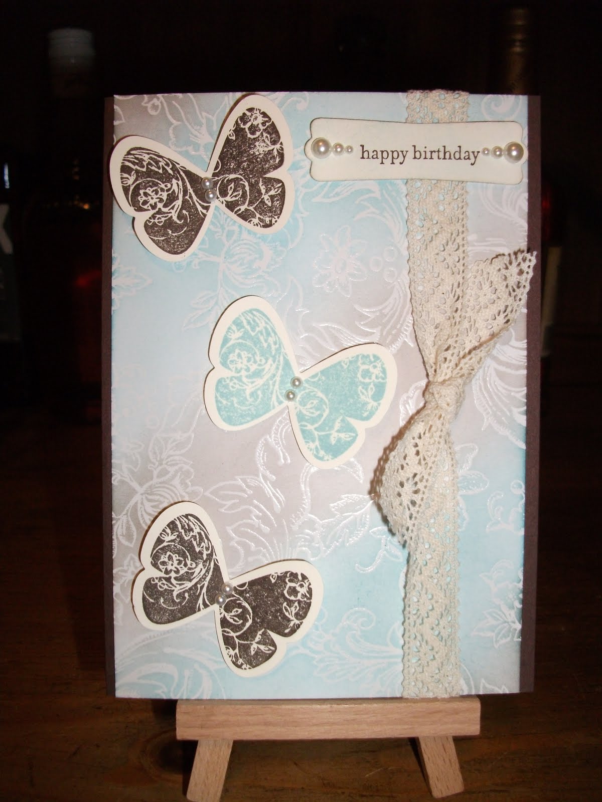
This is a similar design to the one in 'Double but Different Part 2'. I made this for another niece's birthday. Normally with my cards I make a single layer insert to write on, particularly if the base cardstock is a dark colour. For this card I made a double layer insert using the same DSP as I have used on the front of the card. Here's a photo:
I'm pleased with the way the insert turned out. It ties it all together nicely.
(This is a very strange coincidence and it's times like these I can't help but know there's got to be a higher power watching over us all - I couldn't remember if the brad I used was called antique or vintage so I went to check in my bag where I keep the brads. I flipped on the light and saw a big spider just about to crawl inside the bag I needed to check. If I had been a moment later I wouldn't have seen the spider - just rustled around in the bag and possibly would have been bitten!! So there you go. Also, old spidey is no longer with us. I made sure of that.)
Materials:
Cardstock: Rich Razzleberry, Very Vanilla (as the base to stick the squares on), Cottage garden DSP (retired I think).
Ink: Old Olive, Rich Razzleberry.
Stamps: Teeny Tiny Sentiments.
Other: Top Note die, Big Shot machine, Vintage Wallpaper embossing folder, Square punch, Chantilly lace, Antique brads, sponge, dimensionals, Modern label punch, paper piercing tool, mat pack, basic pearls.
Non Stampin' Up: Perfect Pearl Mist in Heirloom Gold.
Tips and Tricks:
1. The patchwork -
- I cut a piece of scrap Very Vanilla cardstock the same size as my card. I should have used PLAIN paper!! If you have a go, please try plain paper first.
- I ran my glue tape in close together lines across the scrap of card.
- I used my new square punch to punch out the squares from different sheets of the Cottage Wall DSP and stuck them carefully onto the glue tape.
- When finished I ran it through the big shot using the top note die.
- I ran the patchwork die cut through the big shot again in the Vintage Wallpaper embossing folder.
- I sponged around the outside of the die cut with Old Olive ink. Yeah it's a bit too dark - I got carried away.
2. The base card is sprayed with the Heirloom Gold mist.
3. I cut a strip of DSP and glued it onto the base card to break up the razzleberry.
4. I punched out two modern labels and cut one in half, spaced it out and glued it behind the other to give that extra bit of border. I sponged around it with Old Olive.
5. The lace -
- I cut a piece and glued the ends behind the top note die cut.
- I cut two shorter pieces, twisted them once and thread them underneath the glued on piece.
- Then I stabbed a hole through them and the cardstock with my paper piercing tool.
- The antique brad was pushed through and secured.
6. I added the smallest basic pearls to the modern label punch out to give it a lift. I added them after I took the photo, so sorry you can't see them.
Stuff Ups:
1. The Very Vanilla cardstock made my patchwork a little bit too thick for the embossing folder so some of the embossed bits split a little. Plain paper would prevent this problem I'm sure.
2. I used too much ink around the top note die cut.
3. Trying to get the brad through all the lace and cardstock was a challenge. It ended up quite bulky so I popped the die cut up on dimensionals to compensate.
4. If I'm being picky, I would only use one type of striped paper and more of it as the two pieces I used don't totally work. At the very least I would try to punch the stripes at the same angle.